
Sr. UX designer - Propriety enterprise apps
Sr. UX designer - Propriety enterprise apps
CASE STUDY
CASE STUDY
CASE STUDY
Standardizing Walmart’s associate experience mobile application
Standardizing Walmart’s associate experience mobile application
Standardizing Walmart’s associate experience mobile application
Conducted a comprehensive audit that resulted in enhanced usability, improved wayfinding, optimized app taxonomy, and the redesign of key user experiences.
Role
Sr. UX designer
Domain
Propriety enterprise apps
Consulted
Engineering, product & business partners.


Role
Sr. UX designer
Domain
Propriety enterprise apps
Consulted
Engineering, product, business partners, UX research, copywriters and facility operations
Background


A better experience leads to exponential growth
Store associates at Walmart needed to use over 90+ different work apps to complete their daily tasks, frequently switching between apps and carrying physical hardware to get their work done.
Me@Walmart was built around associates' core needs, streamlining tasks into one app and enabling the sunsetting of multiple physical devices.
Key metrics
1.36 million
Active monthly users
128 minutes
Weekly engagement time per average user
Challenge

How might we scale with integrity?
How might we scale with integrity?
As core functionalities were rapidly added to Me@Walmart, it became evident that we needed to reassess the existing elements to ensure a cohesive end-to-end experience
Background

I love this app but I need to hit back 8 times sometimes just to switch from one tool to another.
-Sarah, associate

I love this app but I need to hit back 8 times sometimes just to switch from one tool to another.
-Sarah, associate

I love this app but I need to hit back 8 times sometimes just to switch from one tool to another.
-Sarah, associate

I'll be doing produce quality reporting and miss messages or important notifications because I don't see that I have them.
-Eric, Team lead

I'll be doing produce quality reporting and miss messages or important notifications because I don't see that I have them.
-Eric, Team lead

I'll be doing produce quality reporting and miss messages or important notifications because I don't see that I have them.
-Eric, Team lead
Process

End-to-end audit to identify gaps in the experience
End-to-end audit to identify gaps in the experience
We conducted an in-depth analysis of Me@Walmart to identify opportunities for improving usability and way-finding by...
Background

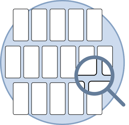
Analyzing over 450+ screens from the perspective of key associate personas.
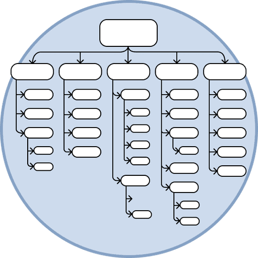
Creating a robust sitemap of the existing app architecture.
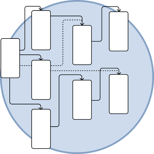
Comparing navigation patterns to internal & external UX best practices.
Results

Insight
Way-finding is not intuitive and access to tools is limited.
Recommendation
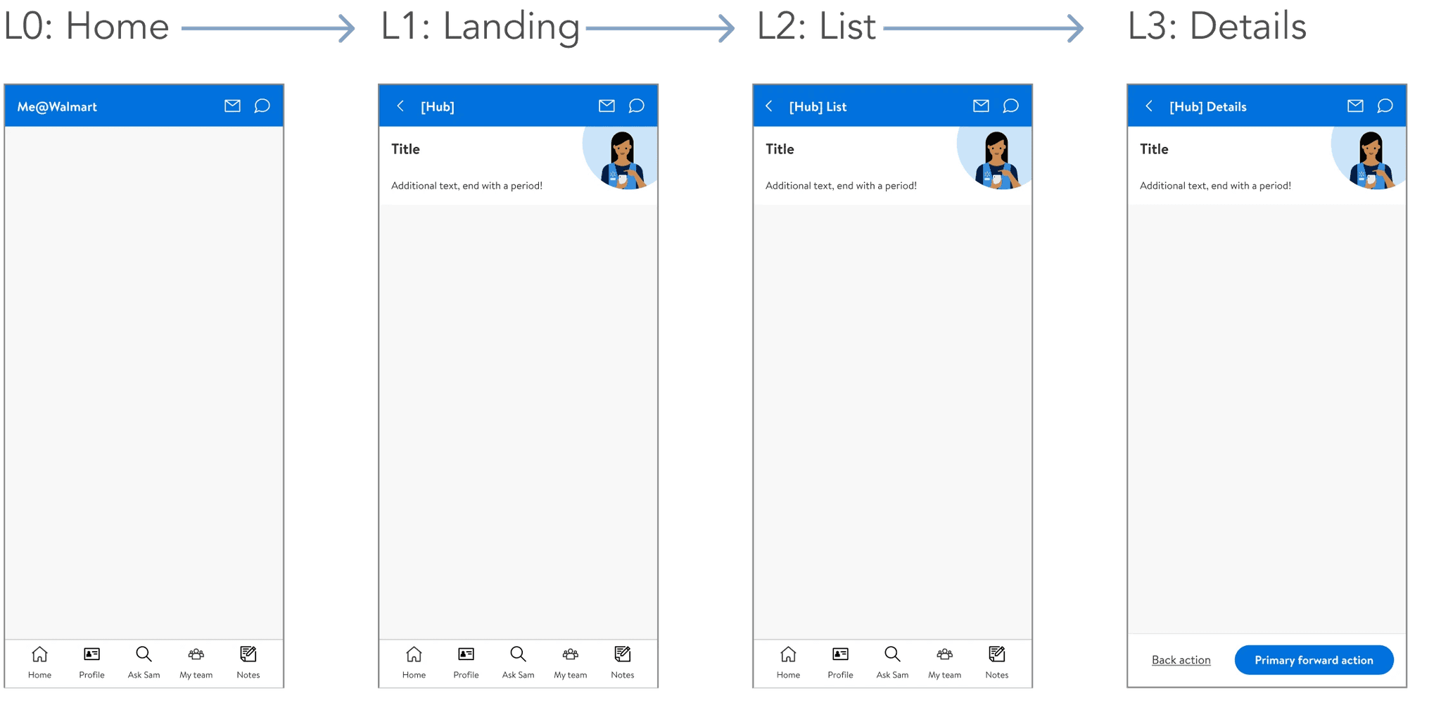
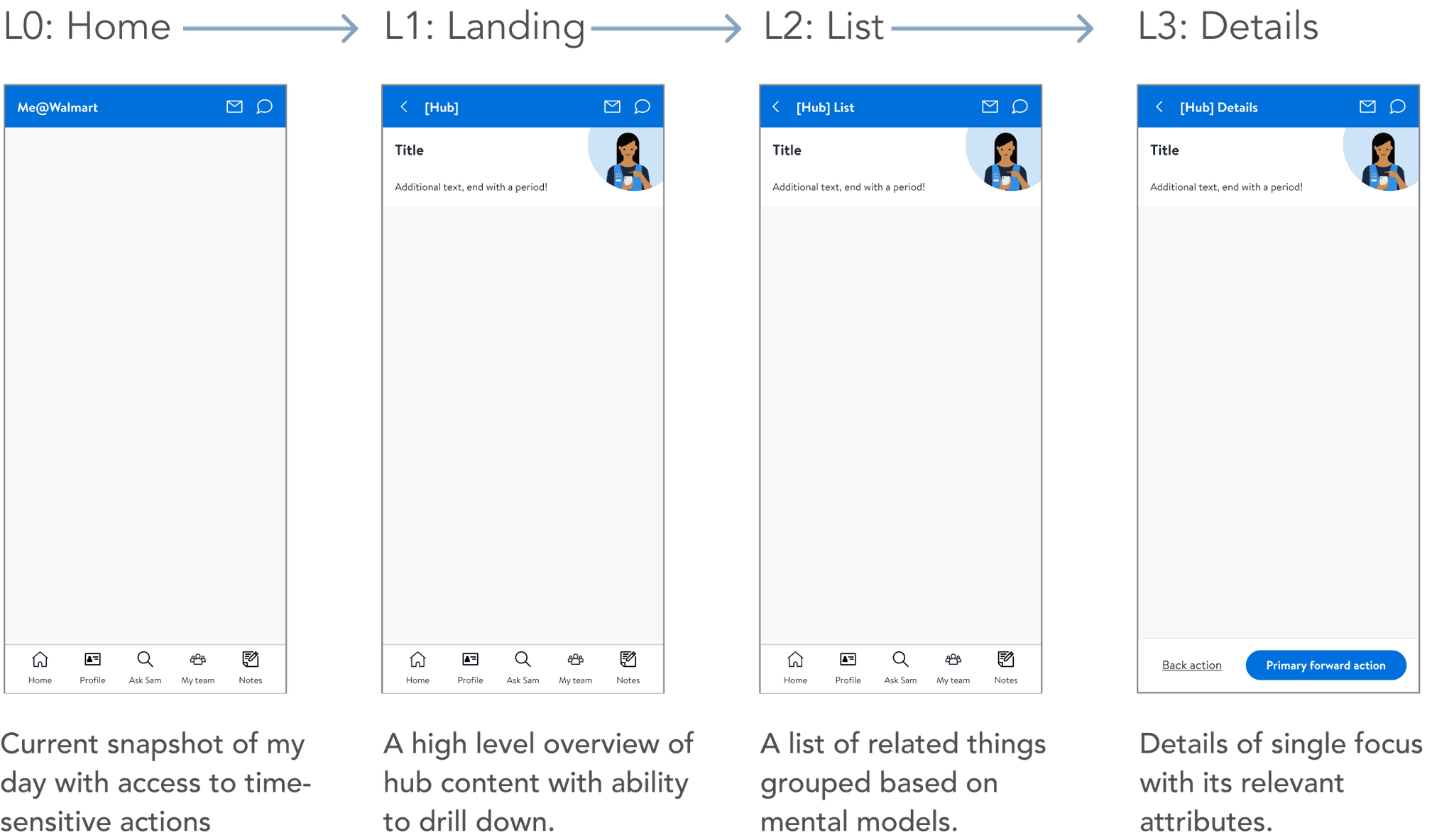
Standardize screen taxonomy. Establish screen levels that consider hierarchical navigation pathways and corresponding templates that use consistent layouts and components.

Action
Action

Navigation Improvements by page level
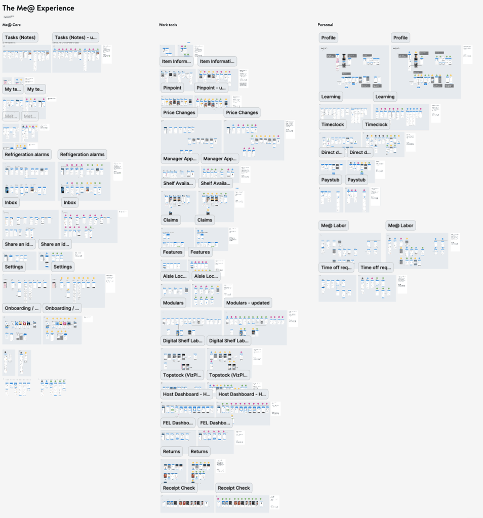
Me@ is separated into core features, work tools, and personal features. We moved notifications and messaging to the top header to ensure they are prominent throughout the experience. We reviewed the happy paths of each feature to outline each page level, allowing the respective product teams to update the bottom footer on Level 2 and Level 3 pages.
Action

Navigation Improvements by page level
Me@ is separated into core features, work tools, and personal features. We moved notifications and messaging to the top header to ensure they are prominent throughout the experience. We reviewed the happy paths of each feature to outline each page level, allowing the respective product teams to update the bottom footer on Level 2 and Level 3 pages.


How are we measuring success?
How are we measuring success?

Projected benefits
Projected benefits
While formal metrics aren’t available, the update is expected to enhance the associate experience by simplifying tool-switching and improving visibility for critical notifications and messages. These improvements aim to reduce friction in daily tasks and ensure associates stay informed, ultimately fostering a more efficient and seamless workflow.
While formal metrics aren’t available, the update is expected to enhance the associate experience by simplifying tool-switching and improving visibility for critical notifications and messages. These improvements aim to reduce friction in daily tasks and ensure associates stay informed, ultimately fostering a more efficient and seamless workflow.
Projected benefits
While formal metrics aren’t available, the update is expected to enhance the associate experience by simplifying tool-switching and improving visibility for critical notifications and messages. These improvements aim to reduce friction in daily tasks and ensure associates stay informed, ultimately fostering a more efficient and seamless workflow.
How are we measuring success?


Background


A better experience leads to exponential growth
Store associates at Walmart needed to use over 90+ different work apps to complete their daily tasks, frequently switching between apps and carrying physical hardware to get their work done.
Me@Walmart was built around associates' core needs, streamlining tasks into one app and enabling the sunsetting of multiple physical devices.
Key metrics
1.36 million
Active monthly users
128 minutes
Active monthly users
Results

Insight
Way-finding is not intuitive and access to tools is limited.
Recommendation
Standardize screen taxonomy. Establish screen levels that consider hierarchical navigation pathways and corresponding templates that use consistent layouts and components.
