My Account | Sr. User Experience Architect

My Account | Sr. User Experience Architect

My Role & Task

At Allstate, I served as a Sr. User Experience Architect on the My Account team, where I contributed to several projects. One of my largest projects was Automated Endorsements.

I collaborated with visual designers, copywriters, and researchers on a team tasked with creating a new process for customers to update their policies online. This process allowed customers to make changes, such as updating a lienholder, adjusting coverage, or adding a new vehicle, via desktop or mobile without needing an agent's assistance. Below, I will outline my processes, focusing specifically on the 'Add or Remove Vehicle' endorsement.

Goals 💯

  • I wanted customers to make choices and be able to proceed with confidence.

  • I believe transparency is very important and the customer should know exactly what they are getting when spending their money.

  • At the same time, there needs to be a balance so customers won’t try to “game the system”.

  • I want customers to feel like this was easy and not a large burden to make any policy changes.

Challenges 🔥

  • Technology limitations  (This meant I had to design around some of the legacy software used to make calls to receive customer information or a quote)

  • Other Allstate products were going through a rebrand. The product needed to be designed to still fit the old branding but could also transition into the new branding very easily.

  • The insurance industry has a negative stigma and can often be seen as sketchy and complex.

Key KPIs

Task completion rate

The percentage of users who successfully completed the process (e.g., adding or removing a vehicle) without needing agent assistance.

  • Pre-redesign: 40%

  • Post-redesign: 85%

Call deflection rate

The reduction in customer service calls related to policy changes.

  • Pre-redesign: 60% of users called agents for help

  • Post-redesign: 30% called agents

Repeated usage rates

Percentage of customers returning to use the online tool for additional changes.

  • Pre-redesign: 10%

  • Post-redesign: 40%

Discovery

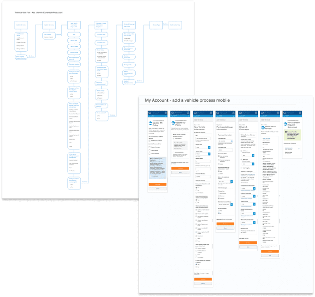
I began with discovery work, mapping user flows and process charts for the existing system. Although online updates were available, the process was lengthy and ineffective. By partnering with the data analytics and business teams, we identified key pain points.

  • Low usage rates due to poorly defined entry points, making the feature hard to access.

  • High drop-off rates, especially during vehicle coverage selection.

  • Lack of clarity on how changes impact policy pricing.

  • A three-day processing delay with no real-time updates.

Let The Iterative Design Process Begin!

For this project, we conducted eight rounds of testing. With each round, we uncovered new problems and discoveries, allowing us to continuously develop and refine our solutions.

Round 1

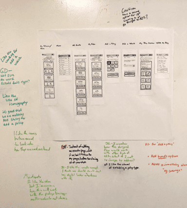
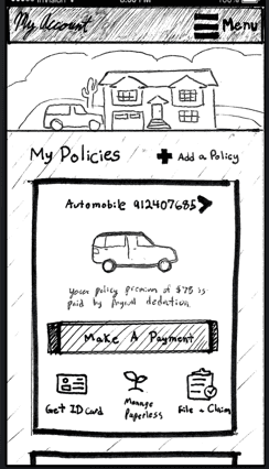
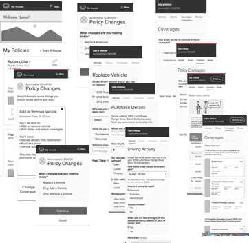
We started the design iteration process by paper prototyping entry points and began research with moderate user interviews.

Round 2

We continued paper prototyping new entry points and brought the screens into Axure to move forward with our research testing.

Round 3

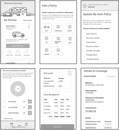
We began designing digital wireframes and testing new design solutions of the full “Add and Remove vehicle” process.

Round 4

We started to go over different user scenarios to create a more modular experience. Such as if a user added a new vehicle should we allow them to add a new driver with in the flow, etc.

Round 5

Our iteration process continued. We stated to make prototypes with reactive animation and higher functionality in axure to be tested.

Round 6

Here we brought in visuals and moved to a high fidelity html prototype for testing.

Round 7

We chose to design mobile first but round 7 was dedicated towards testing a desktop version of the experience.

Round 8

Design solutions were being finalized and we completed one more round of testing of both desktop and mobile.

Designing Solutions

This project was very large and there were many findings and designs that changed along the way. I’m going to share a few samples of how my design solutions progressed below.

Drivers Section

Before redesign

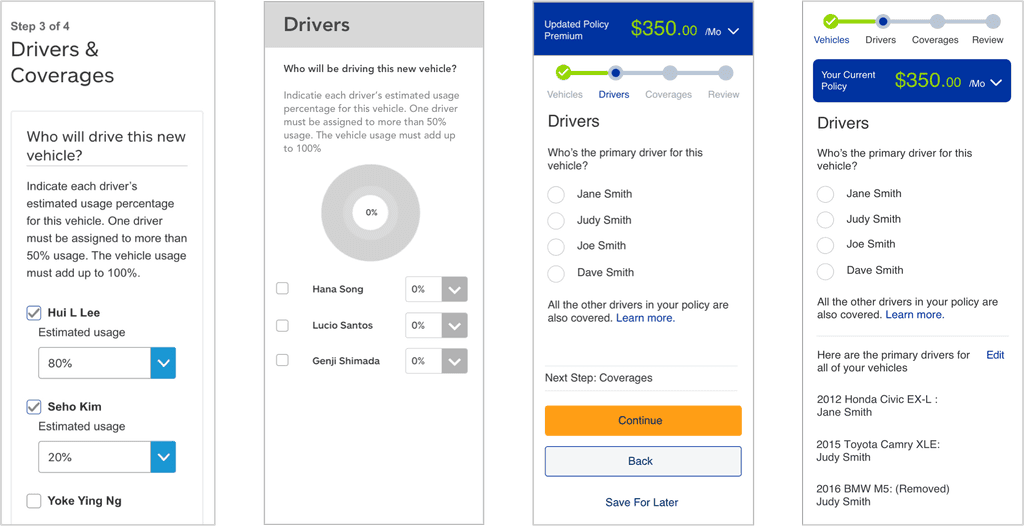
“Who will drive the new vehicle?”. Is a question we have to ask to determine how much their policy price will increase or decrease. This is because some drivers are more liable than others.

Early iteration

During testing, we found most users hit a few checkboxes quickly and/or do not have the estimated usage add up correctly to 100 %. One of the early design solutions I came up with was a better way to visualise the usage adding up to 100%. As users select a percentage of the circle would fill up in blue.

Another iteration

Uncovering more about the “Why”. The more I looked into how agents enter information in alliance (specific program agents use to calculate a price for customers and that we will have to send data to.) The more I learned that everyone on the new vehicle is covered and who is the primary driver is the only information needed. The reasoning for the percentage is that Alliance is legacy software that needed to deal with multiple percentages for a specific US state that allowed an older version of Allstate policies to cover only a select few people in a household. Now it’s required that everyone listed on a policy will automatically be covered.

Final solution

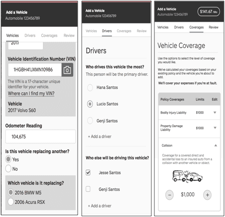
The problem wasn’t fully solved for yet. The previous iteration tested well, but we wanted to also be able to cover a wide variety of senerios. Example: If Jane bought a new car maybe she will no longer be the primary driver for the 2012 Honda and will be giving that car to her son. We wanted to give users the capability on this page to see who are the selected primary drivers for their other vehicles, as well as allow them to change that within this flow as all these things can affect rate.

Vehicle coverages

Before redesign

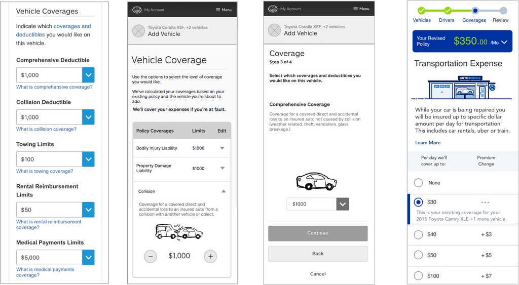
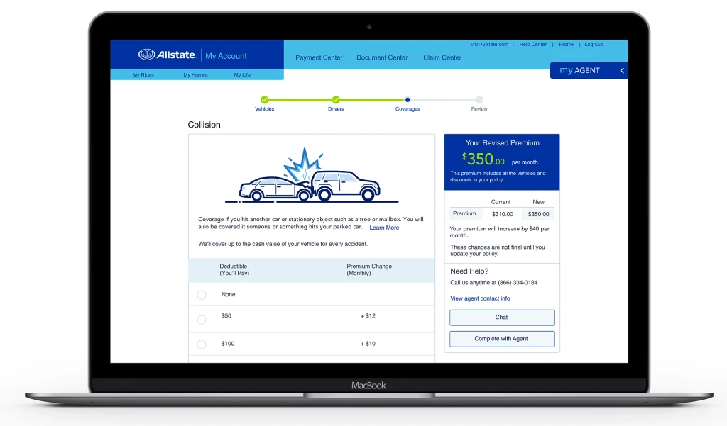
It was important for us to completely redesign the vehicle coverage section as this is where the previous version of the site had the highest drop off rate

Early iteration

We discovered that most customers did not understand what all the different coverages were or what they were exactly getting with that coverage. We also found that displaying all the information of coverages at once caused frustration for the user. One of the early iterations used an accordion that would reveal an image along with a description to help educate the user of what each coverage was but would present the information in bits. However, during testing, we found that users were not inclined to click the arrows that opened the accordion. 

Another iteration

I designed the coverage section to be broken up into their own pages. I also designed a simple animation that could help tell a story of what that coverage was protecting your vehicle from. This was to help reduce the cognitive load on the user as well as help educate them in what they are selecting. In research testing, we found that customers felt they understood what the coverage was however they were still wanted to know exactly how their premium would change based on their selection and wanted to know if they selected this coverage for any of their other vehicles.

Final solution

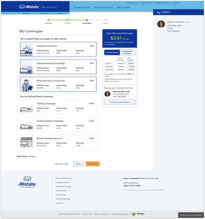
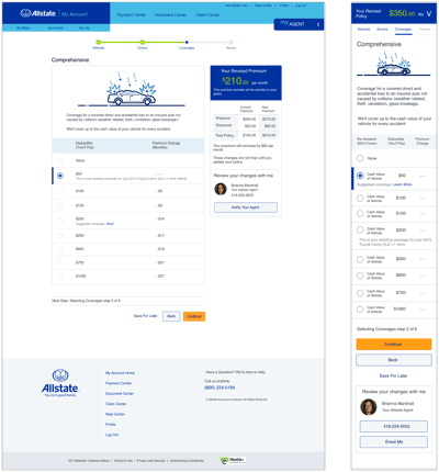
My final solution was to display a chart and use plain language to explain exactly how much they will be covered up to and how much their premium would change. We also displayed a text line showing if they had this coverage selected already for any of their existing vehicles. This one tested so well our partners in AOS (Allstate online sales) an online quoting tool decided to incorporate this pattern into their product as well.

Price Tracker

Early iteration

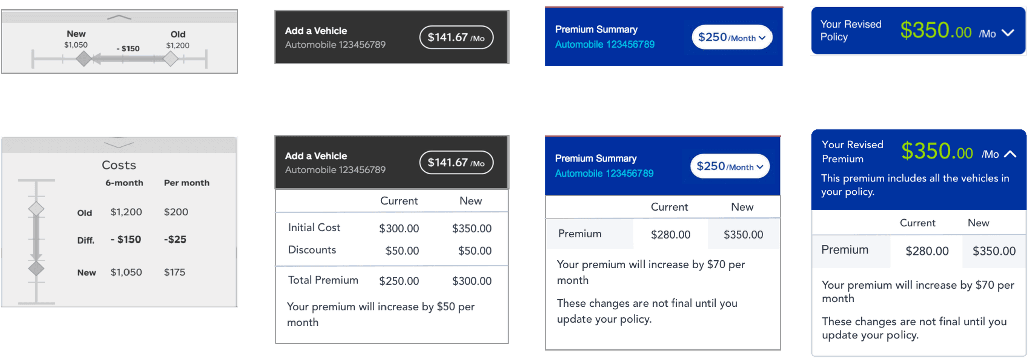
One thing I wanted to accomplish was a way for the customer to track their price and see how their policy price updates as they make changes to it. This was an initial idea where we had this bar displayed at the bottom of the screen that would update as the customers made changes. During testing we found most users got “banner blindness” and did not notice it.

Another iteration

The design changed quite a bit in this next iteration. First, I moved it now to the top of the screen hoping this would help to eliminate banner blindness. Second I found we do not need to show 6-month or per month. This was because if a customer is in My Account we already know their chosen method of payment which we could default to. The third thing was that we had some technical limitations. To show an update in pricing we would have to make a call to Alliance (a legacy tool we will have to use on the back end to receive all of the customer's information necessary to give them an accurate price). It takes 3-4 seconds for that call to be reflected on stage. So users would know that their price was updating I decided to create an animation that would show a new price is loading for them.

Another iteration

In an early iteration of the entire flow, we had a page that showed discounts customers are receiving when they enter which safety devices their vehicle had (such as airbags) and wanted to show the reflected discounts in this policy price break down. However, do to technical limitations along with launch timing we had to eliminate it for MVP. Another finding from research we found customers did not know to hit the price button to see a breakdown so we added a carrot/down arrow. This iteration also shows a copy update which lets the customer know their changes will not be final until they submit them. This was also included for legal reasons.

Final solution

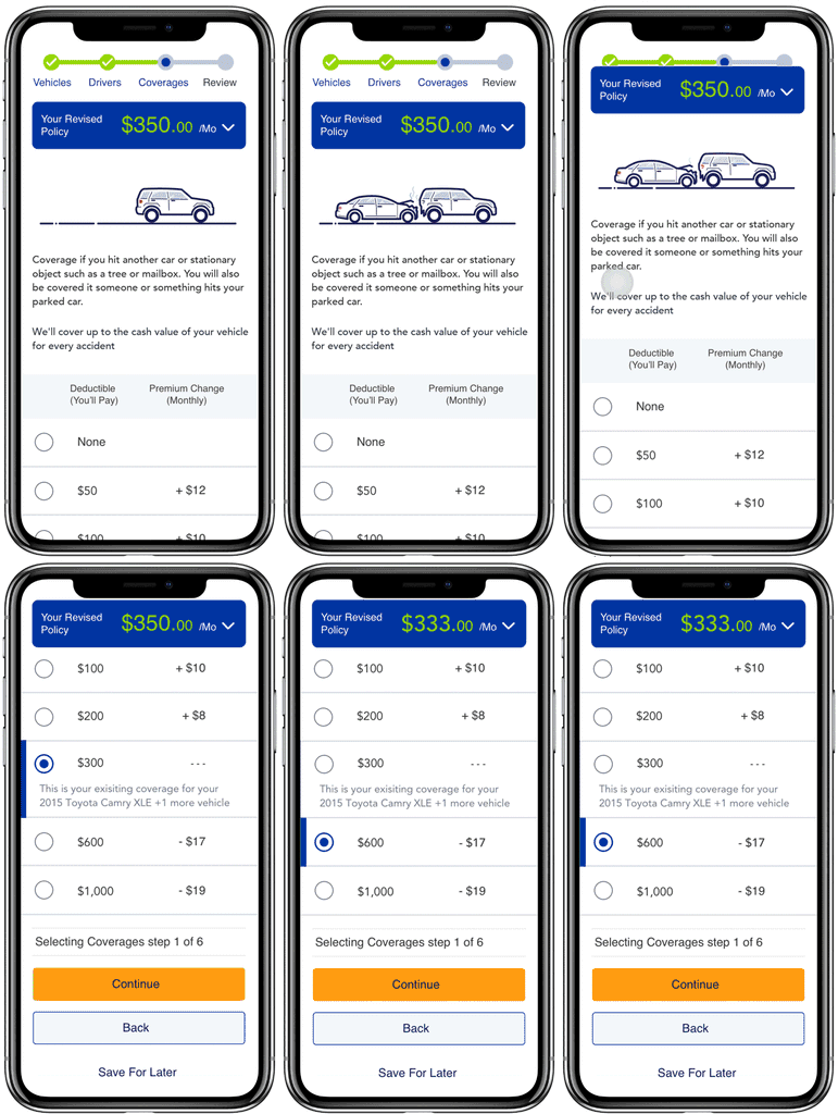
In our final solution, I decided it needed to be simplified it a bit more. We enlarged the price and updated the copy. We also moved it below the price tracker and made it a sticky header so after users scrolled down it would still continue to follow. This solution tested very well users no longer got banner blindness and know that tapping it, it would expand for users to see more information. We also found we no longer needed to use a loading animation for a price delay as we could make an initial call to Alliance in one of the early pages and do the math on page for the user so changes would reflect instantaneously. (See final design example below for how it behaves)

Examples of finished product

Let's connect

Let's connect

Curious about my work? Let’s chat design, collaboration, or new adventures!